|
|
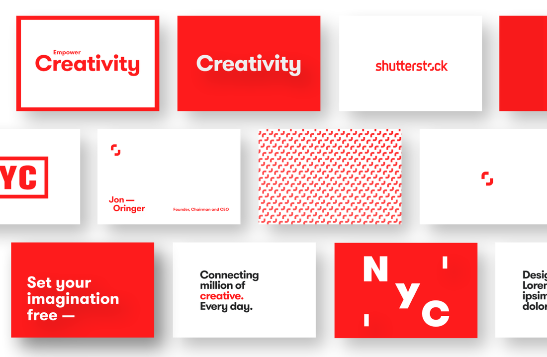
Design
|
|

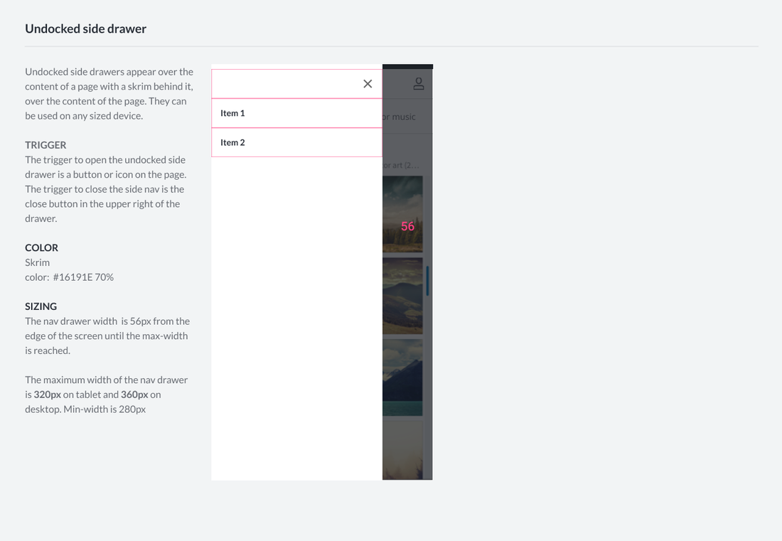
Navigation Architecture
|
|
NAVIGATION ELEMENTS
SCALING CONSIDERATIONS
|
|
|
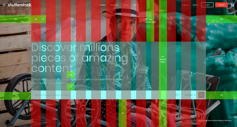
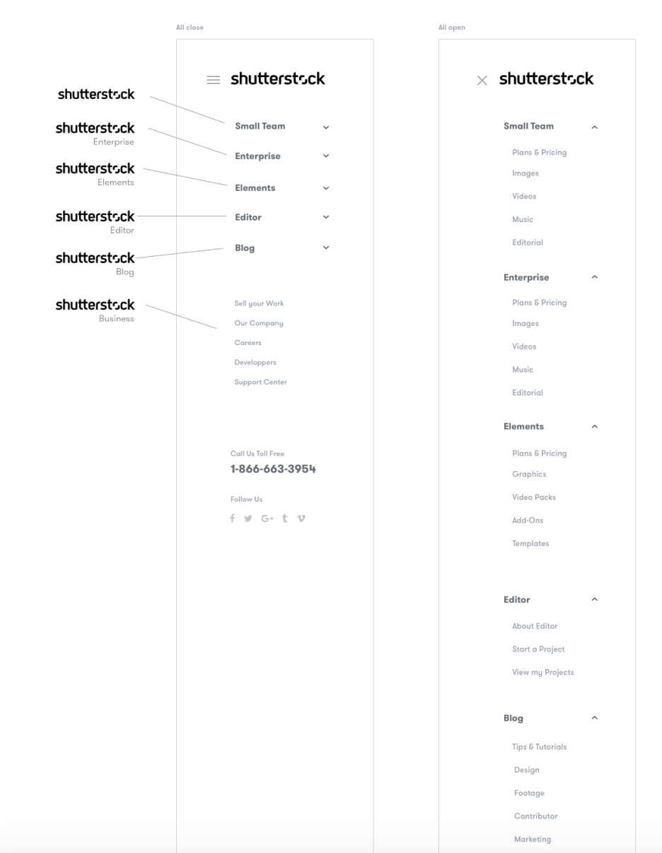
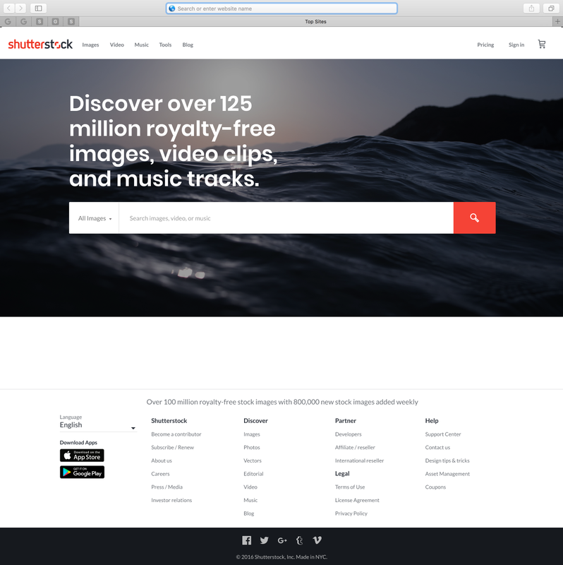
Desktop Header & Footer 🖥️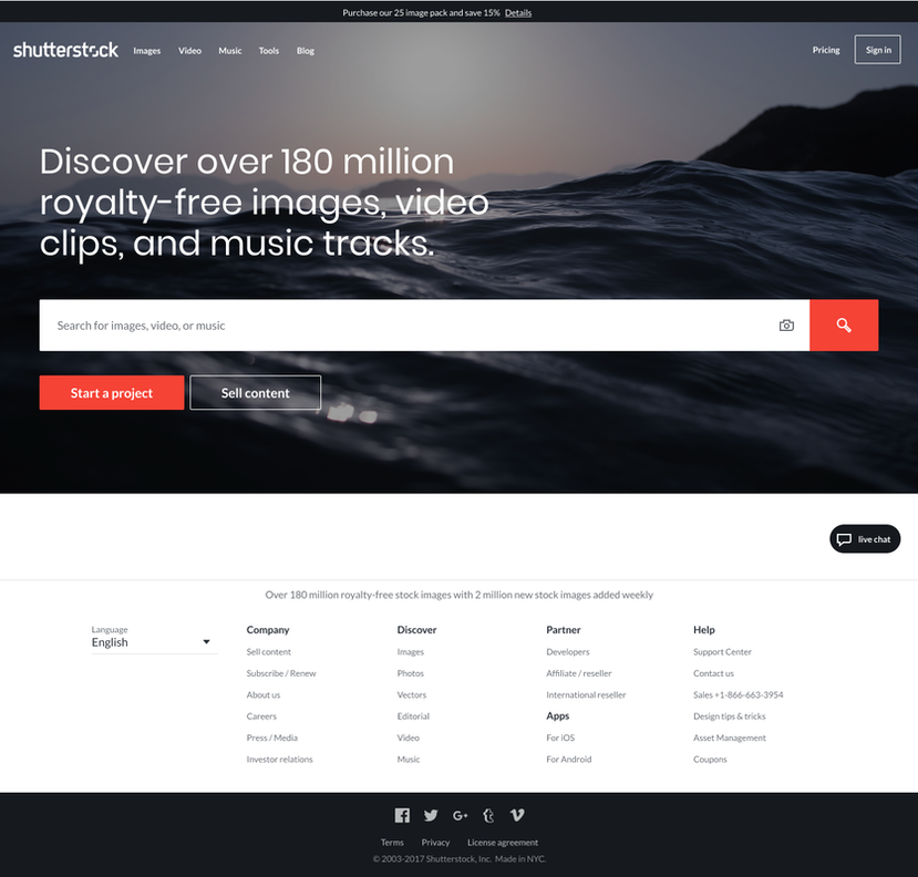
An efficient search option is crucial to a successful experience for Shutterstock users on the site. A clean navigation is helpful for sites who have a large product inventory. The products can be loaded faster, and the customers can easily move towards the end of the sales funnel.
The overall look and feel sough to capture our leadership in the creative technology market place. Fast Search. Great Content. Lots of Tools. It prioritized efficiency for the user - and the sleek UI also captured our brand positioning. |
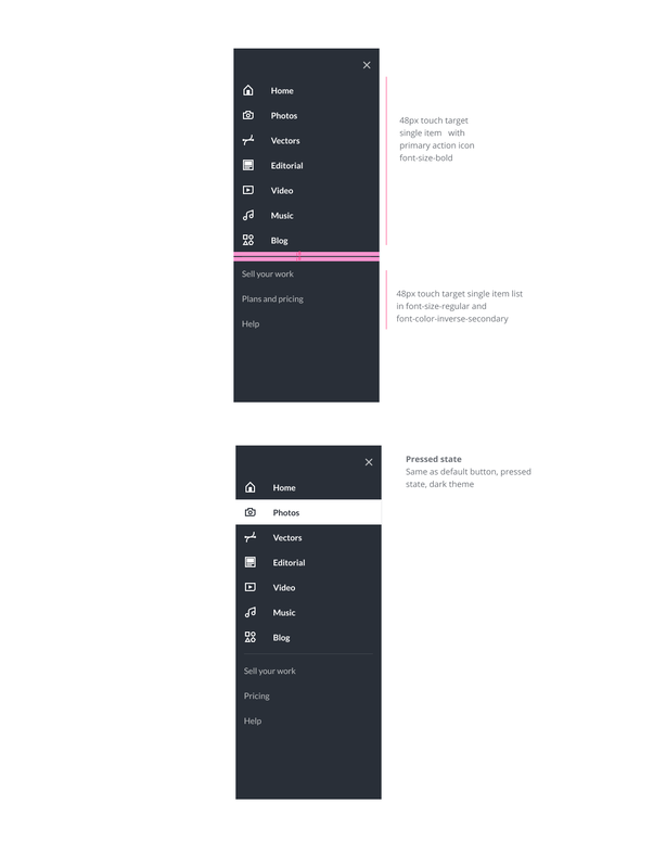
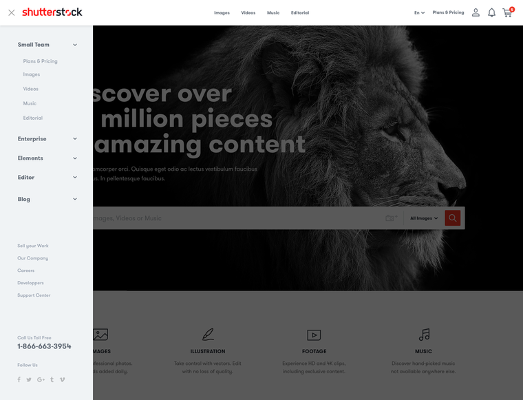
Designing for Scale - vertical navigation concept
|
We also experimented with a centered layout for the product lines - as well as a vertical navigation pattern used by eCommerce giants like Amazon and Home Depot. These design decisions would help drive upcoming user testing...
|
|
|
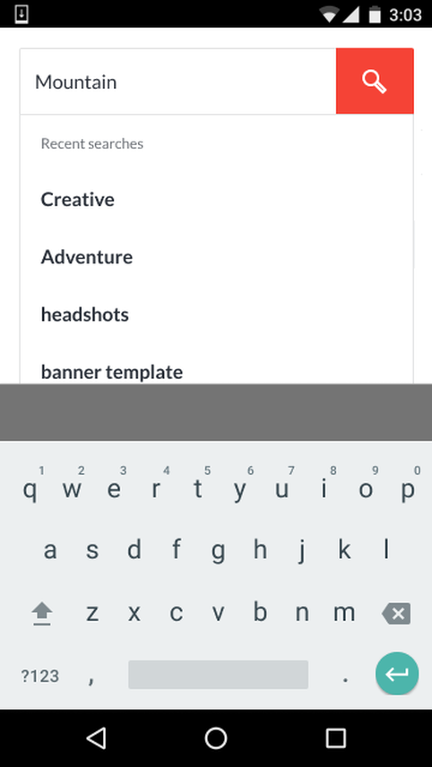
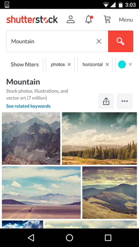
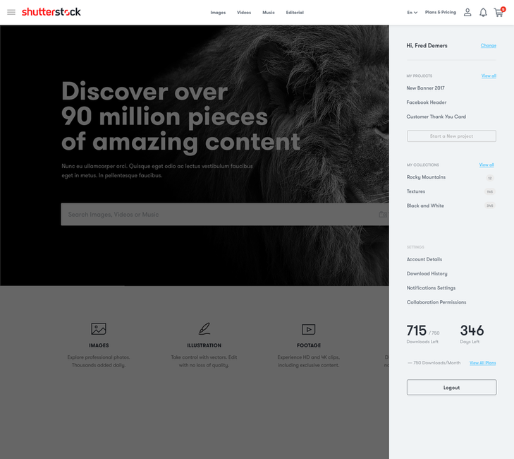
User Feedback 👨🏽💻We constructed a Usability Lab at the office and proceeded to conduct extensive user testing.
Our power users informed us that the new experience would immediately expedite their creative workflow, bringing greater value to the Shutterstock business. During testing, users tended to shift towards the logo when looking for the products (photos, footage, music, ect.,). Moving the navigation from the center-to-the-left was an update to the design that helped both comprehension and usability. LEARNINGS - Left align navigational elements - Labeling &iconography improvements |
|
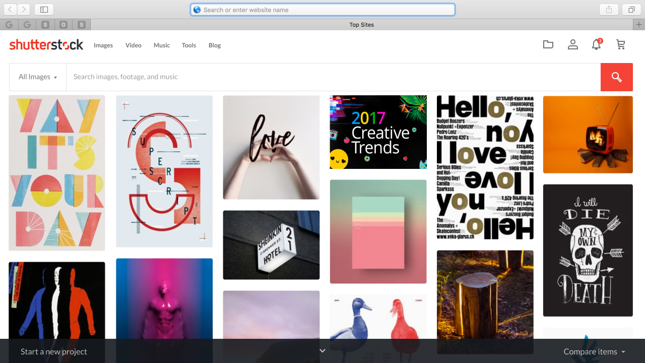
Launch 🚀
|
|